
Case Study
New Look Vintage: commerce concept website
Timeline: July 2nd- September 2nd 2023
Role: Branding, competitive analysis, conducted usability testing, improved user flows, and created wireframes

Intro
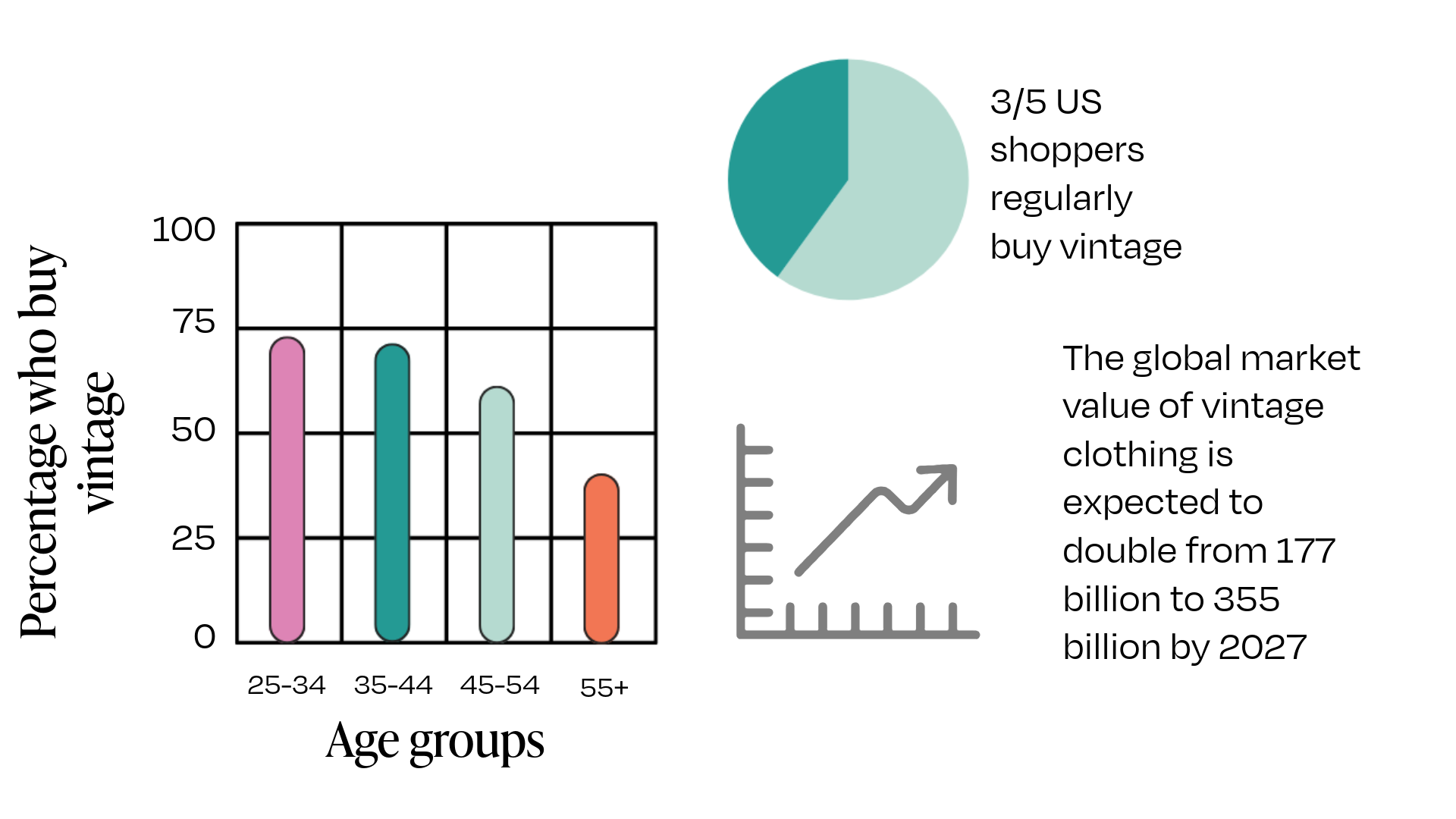
The purpose of this project is to design a user-friendly and visually appealing mock e-commerce website called “New Look Vintage,” that specialized in selling vintage clothing and accessories. Items will be curated and filtered by decade, style, and clothing type. In person business has seen a sharp decline since 2020, while national e-commerce sales increased by $244.2 billion or 43% in 2020, the first year of the pandemic. The company seeks to establish a presence in e-commerce, connect with collectors worldwide, and tap into the green, sustainability resale market.
Branding

New Look Vintage refers to a style popularized by designer Christian Dior between 1946-1964. The “New Look" celebrated ultra-femininity and opulence in women's fashion. The company’s name is also a nod to its commitment to re-using items and countering the effects of fast fashion.
Competitive analysis

Goals
Create Intuitive and user friendly interface that allows users to easily navigate through different sections, explore products, and complete purchases without confusion or frustration.
Seamless checkout process, minimizing the number of steps required for users to complete their purchase. Clear calls to action and transparency about shipping and return policies.
Easy search and filtering, enabling users to find specific items based on criteria such as era, style, size, color, and price.
Develop design that aligns with vintage fashion aesthetic, creating a strong brand identity and leaving a lasting impression.
Product showcase: highlight the uniqueness and quality of the vintage clothing and accessories through clear and high-resolution product images and detailed descriptions.
Test subject
I created a mid-fidelity desktop prototype for New Look Vintage e-commerce website and then ran user testing.
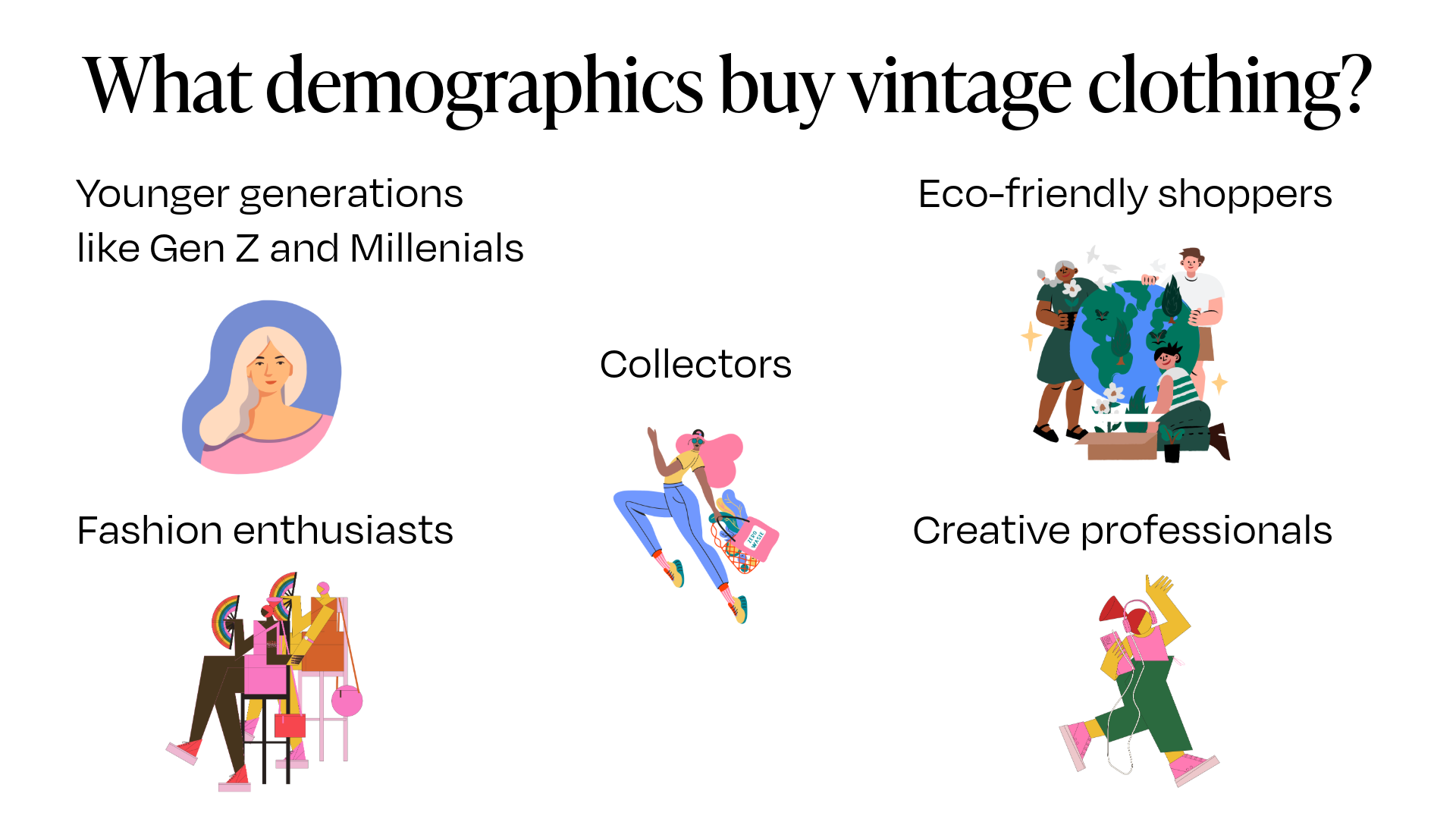
Target audience
Test participants


Interested in digging deeper into my UX research strategy? click below
-
Test the overall ease of use regarding navigation and flow of design.
Test how easily users can find a specific item using menus and filtering options
Test how intuitive and efficient it is to checkout with a product
Rate users overall satisfaction with the website
Identify areas which can be improved, current pain points and potential pain points
-
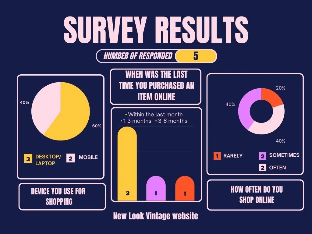
Testing was performed in person.
Participants were observed performing five specific tasks and then asked to rate their experience using a Likert scale.
Participants were encouraged to think aloud as they completed tasks.
In addition, their comments, actions, behaviors and reactions were noted and analyzed.
-
A website that invokes a high end, boutique feel with a curated selection of clothing
User’s perceived ease of use in: finding the correct size, saving favorite items, and checking out
Average time spent on site is over 120 seconds
Repeat visits by customers
At Least three pages visited per visit
Low bounce rate
-
Script
Hi, _____. My name is Hannah, and I’m going to be walking you through this session today.
Before we begin, I have some information for you, and I’m going to read it to make sure that I cover everything.
You probably already have a good idea of why we asked you here, but let me go over it again briefly. We’re asking people to try using a website that we’re working on so we can see whether it works as intended. The session should take less than an hour.
The first thing I want to make clear right away is that we’re testing the site, not you. You can’t do anything wrong here. In fact, this is probably the one place today where you don’t have to worry about making mistakes.
As you use the site, I’m going to ask you as much as possible to try to think out loud: to say what you’re looking at, what you’re trying to do, and what you’re thinking. This will be a big help to us.
Also, please don’t worry that you’re going to hurt our feelings. We’re doing this to improve the site, so we need to hear your honest reactions.Item description
User recommendations
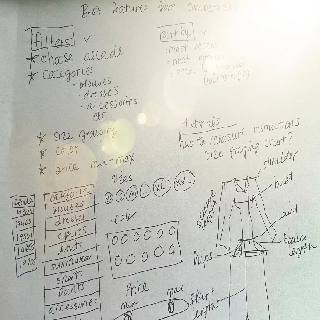
I synthesized all the data from user commentary and post test interviews to define user recommendations. I incorporated these comments into the next iteration of my wireframe.


My solution
-
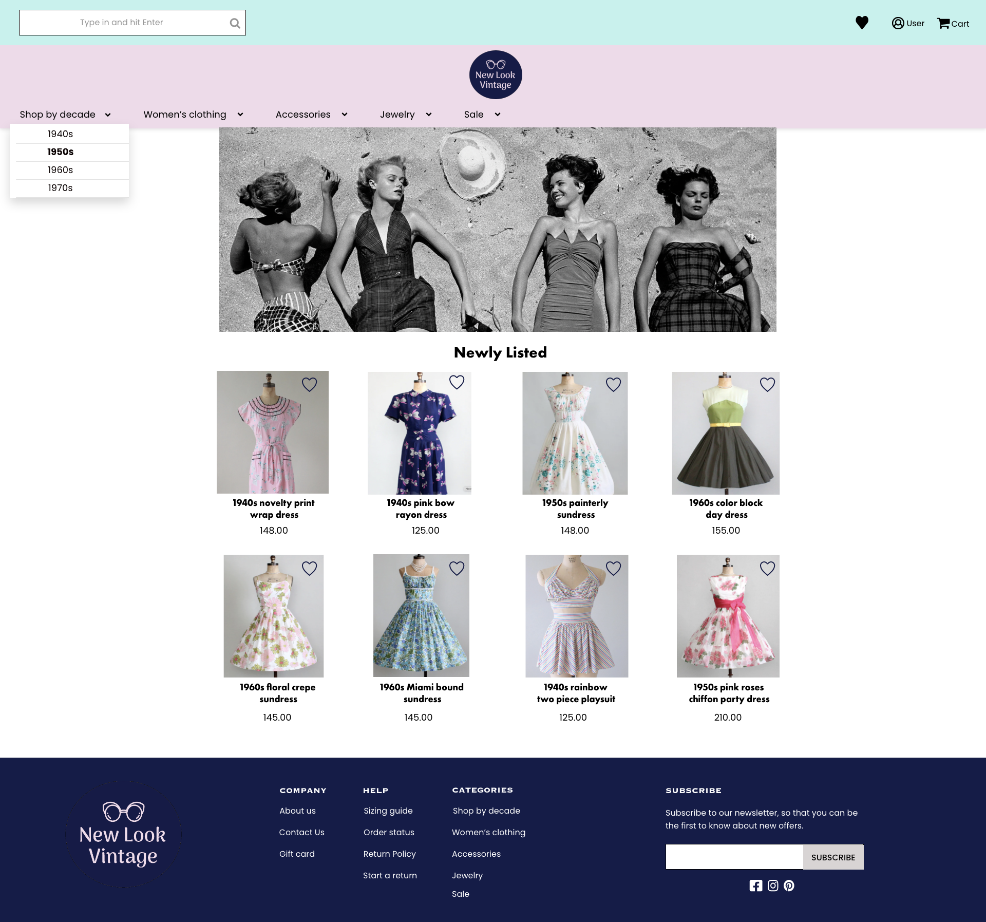
![Landing page for vintage clothing e-commerce website]()
Homepage
-
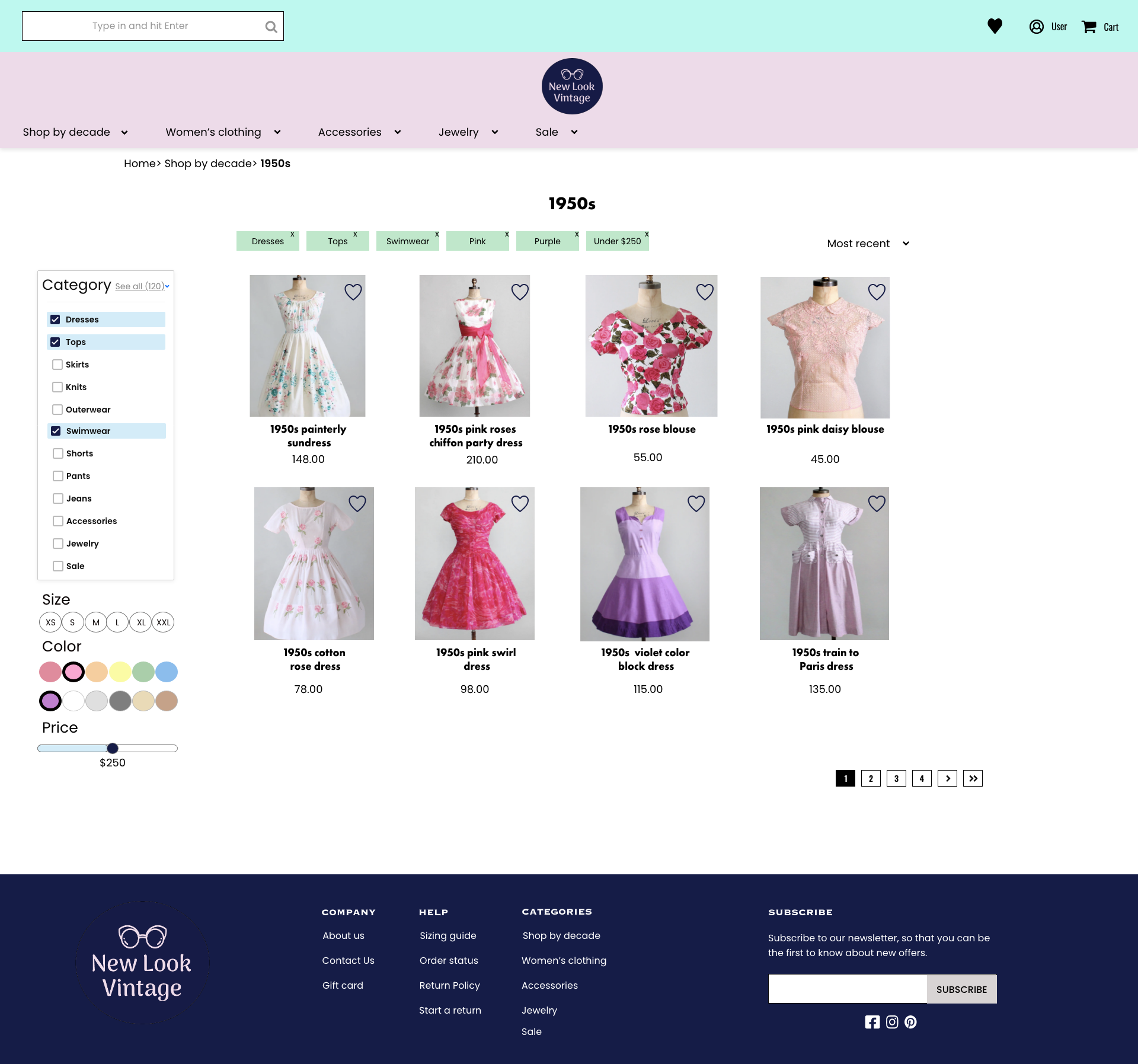
![Vintage clothing website with advanced filtering options]()
Advanced filters
-
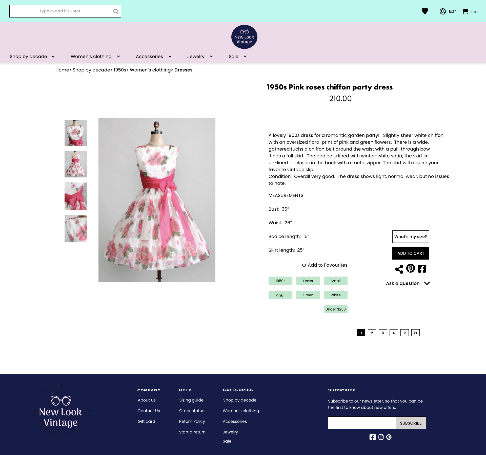
![Vintage clothing e-commerce website product page displaying a dress with pink roses.]()
Product page
-
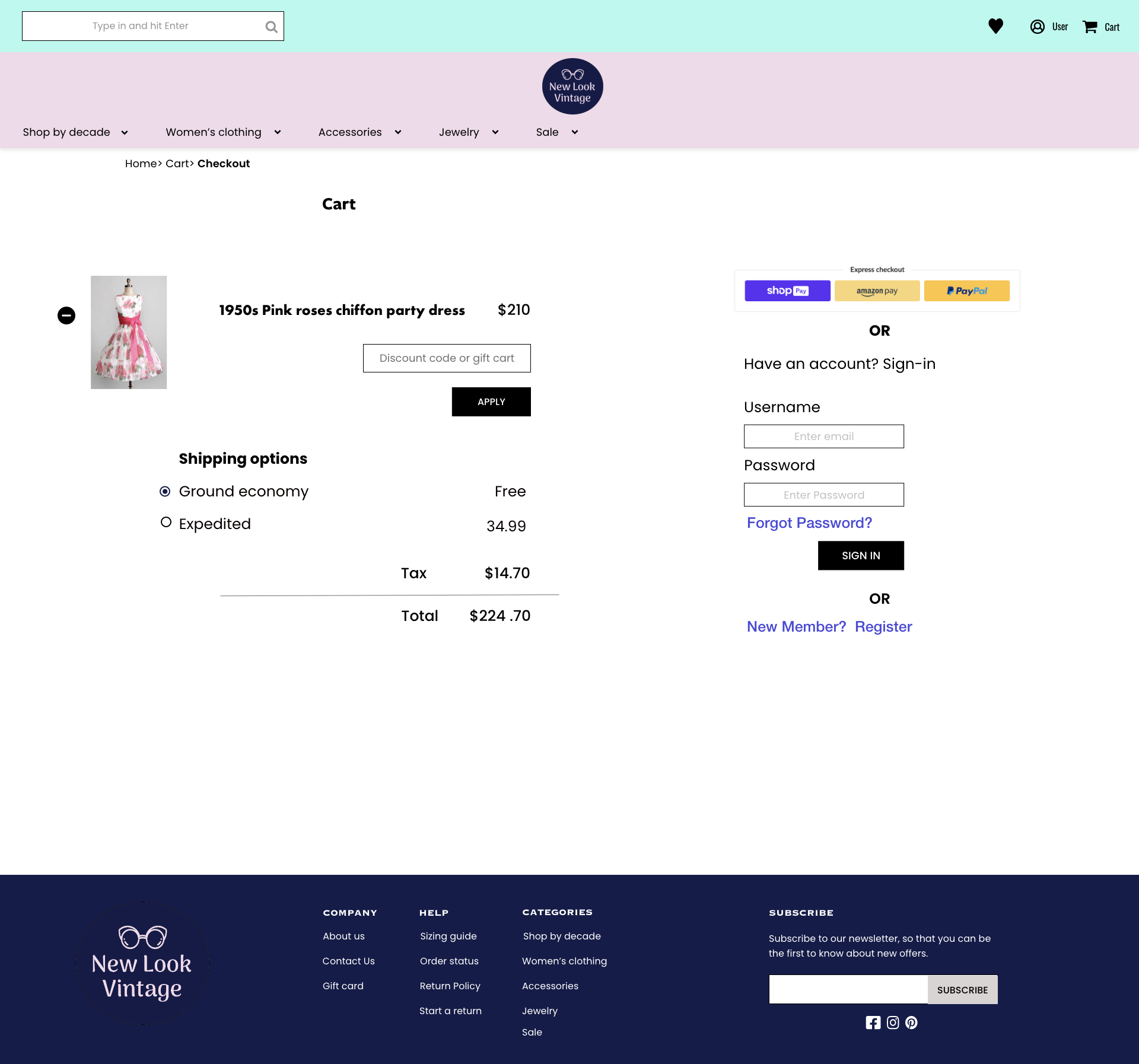
![Vintage clothing website cart checkout page]()
Cart
-
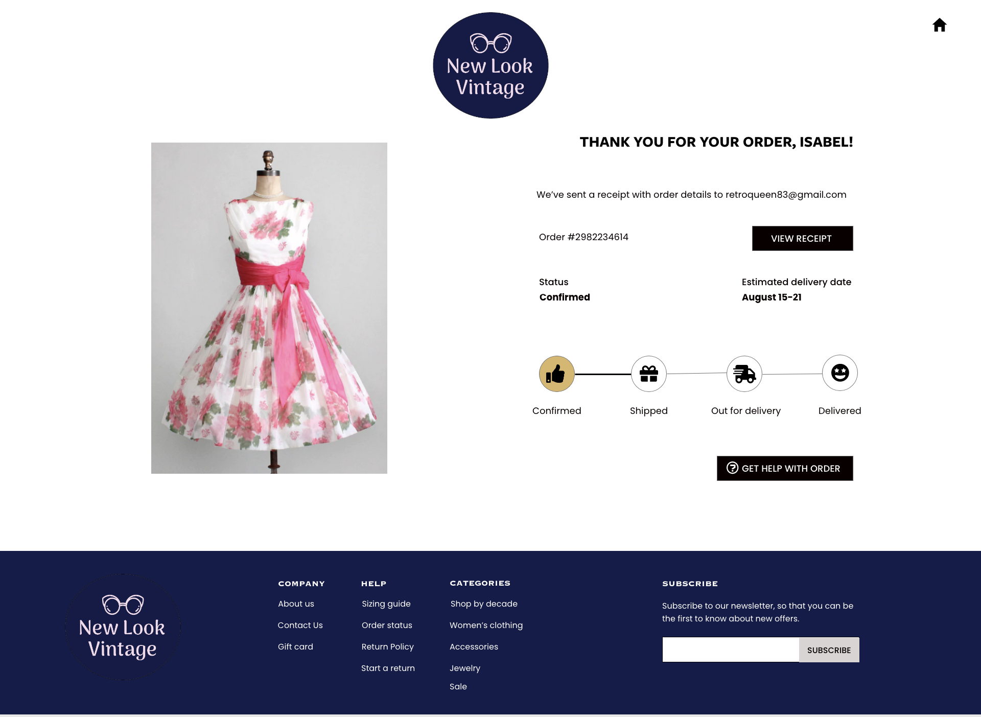
![]()
Purchase confirmation
Lessons Learned
One of my users had low vision and wore glasses. She made several comments about the size of text (both positive and negative) as well as the spacing between letters. Ultimately I ended up choosing a more legible font.
Styling for branding is incredibly important for capturing the essence and personality of the company, but being able to share your message is always the most important criteria.
“Typography has two main purposes in graphic design: the first is to promote legibility, and the second is to help communicate the messaging, tone, and sentiment of a design piece.”

